PROJECT: DoubleDown Fort Knox casino app
PLATFORM: Mobile iOS and Android
CONTRIBUTIONS: Early iterative development, including UX (with Peter Lewis and Janine Bostock), Iconography, Look and Feel, Style Guides.
An Entertainment App
Early on in our prototyping phase, we discussed our needs and what our customers expected. Our previous app, Doubledown Casino, had suffered to some extent from an ability to scale content. So we went in, knowing that we would be creating an app with a lot of game content, that would need to be navigable swiftly in order to complete the user expectation that their favorites would be easy to find, and that new games would still be surfaceable.
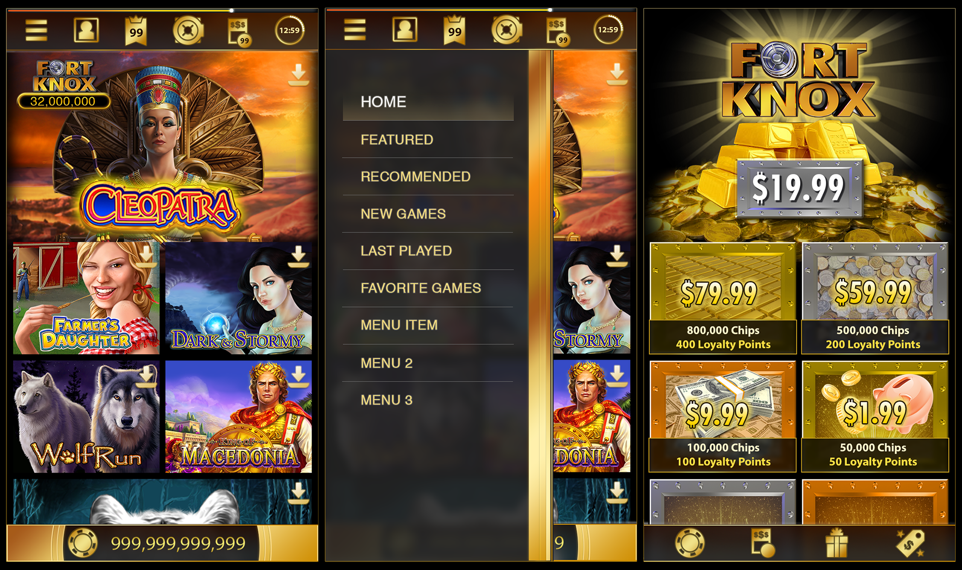
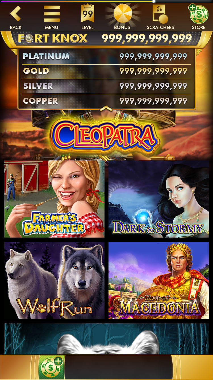
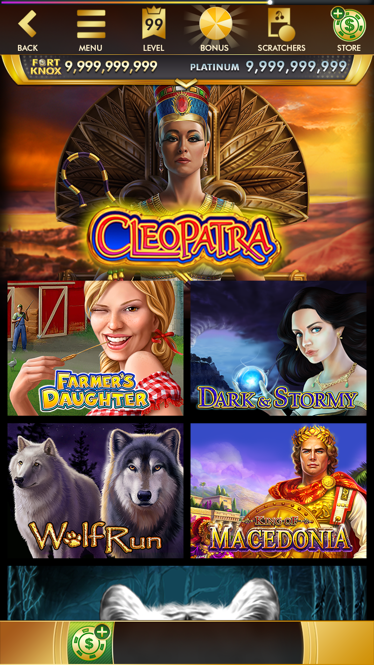
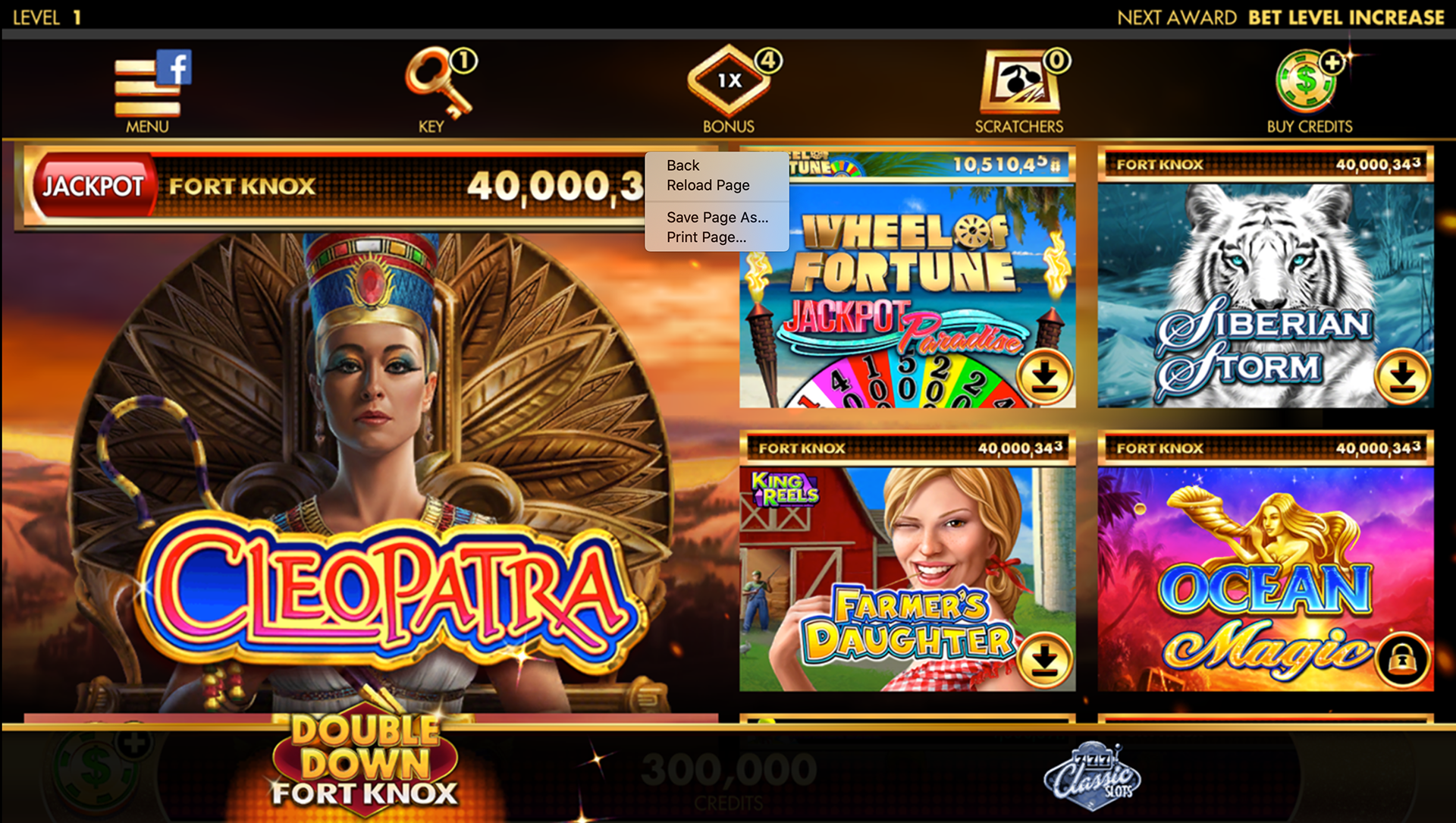
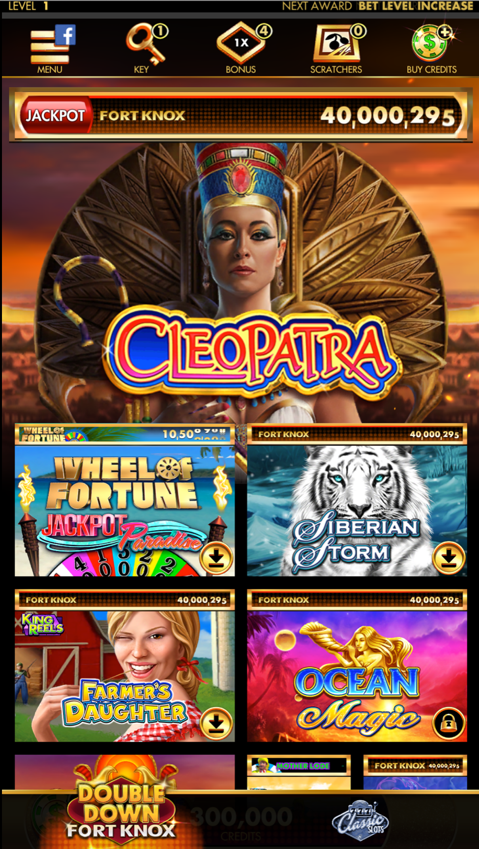
With that in mind, we looked at apps like Netflix and game platforms like Playstation. We moved away from a diagetic (in-world) navigation and skeuomorphic icons to a flatter design. But to keep it grounded in the world of Fort Knox, we went with what would be christened Fort Knox Glass: an Art Deco inspired tiling scheme that utilized various Unity shaders to create a visually more simplified look that other casino apps, but would still scale.
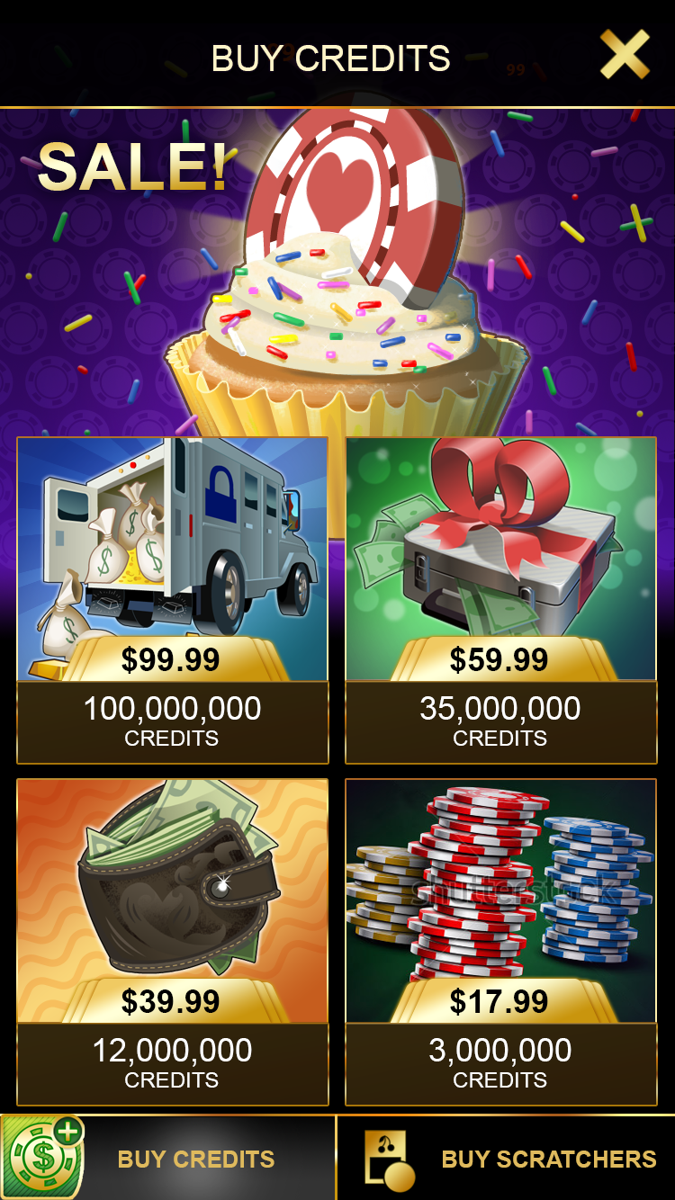
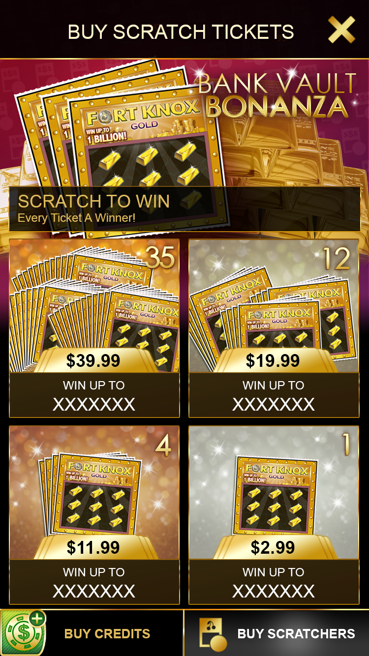
The tiles came in three different sizes that would allow for different configurations. There was supposed to be a Hero tile with bleeding edges and parallax elements, acting as the focal point for new content or anchoring sub-sections. There were also two types of bounded, static tiles, a smaller size and a 2x2 size, with a third specced-but-never-implemented marketing tile that could be either 1x2 or 2x1 and used for internal app positioning of promoted content.
Adaptive Layout
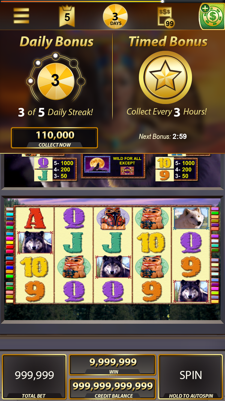
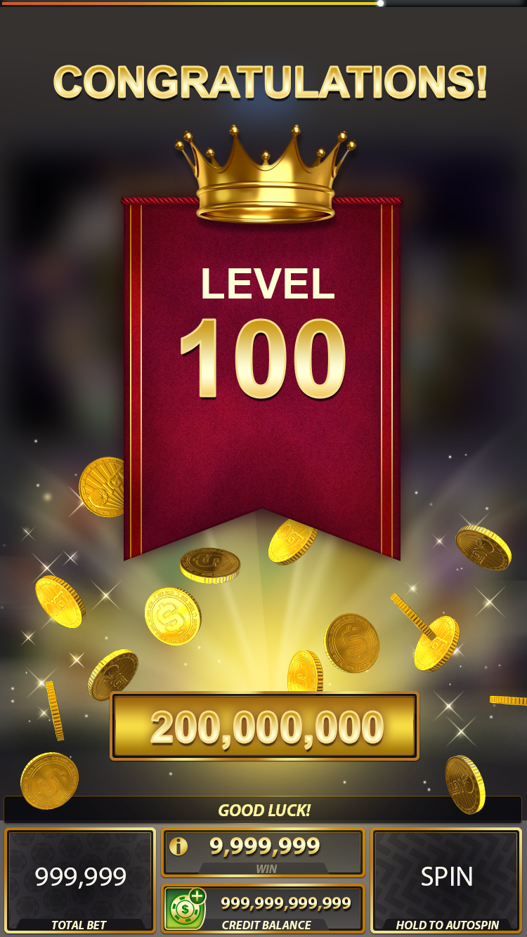
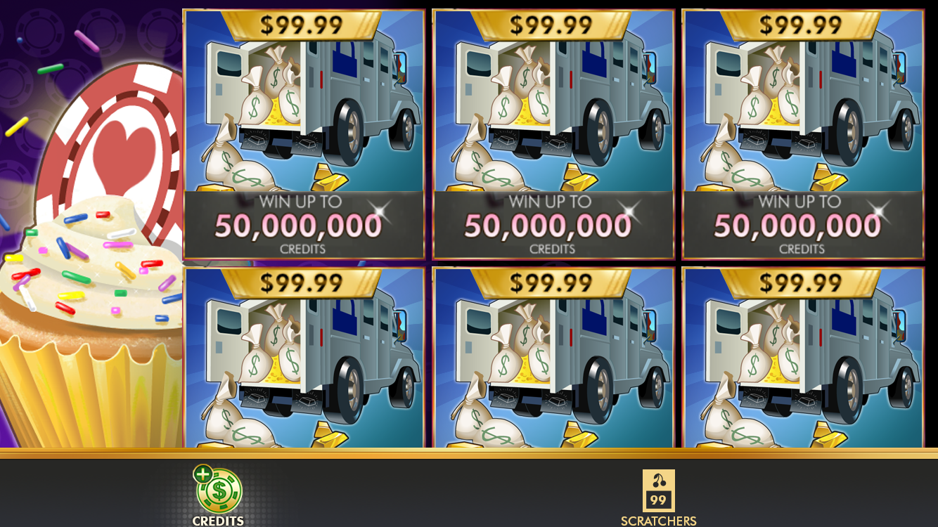
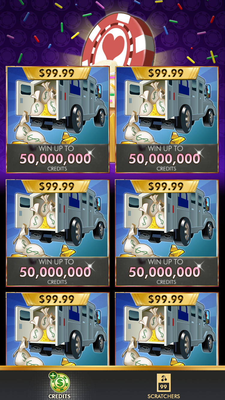
One of the primary features our stakeholders landed on was an adaptive layout. We envisioned an app where people could be playing one handed on the bus, then sit on their couch at home and turn their device sideways for a more immersive experience. Both portrait and landscape views had virtues, so we didn't want our users to be locked into one view, which was very common in casino apps. Some games utilize stacked reels and thus need the vertical footprint. Others feel lusher and more detailed in landscape.
Fort Knox Style Guide and Copy Library
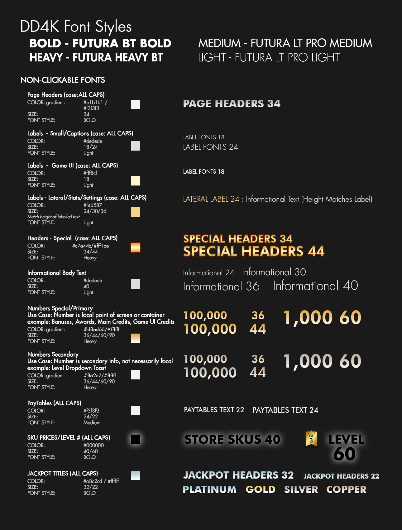
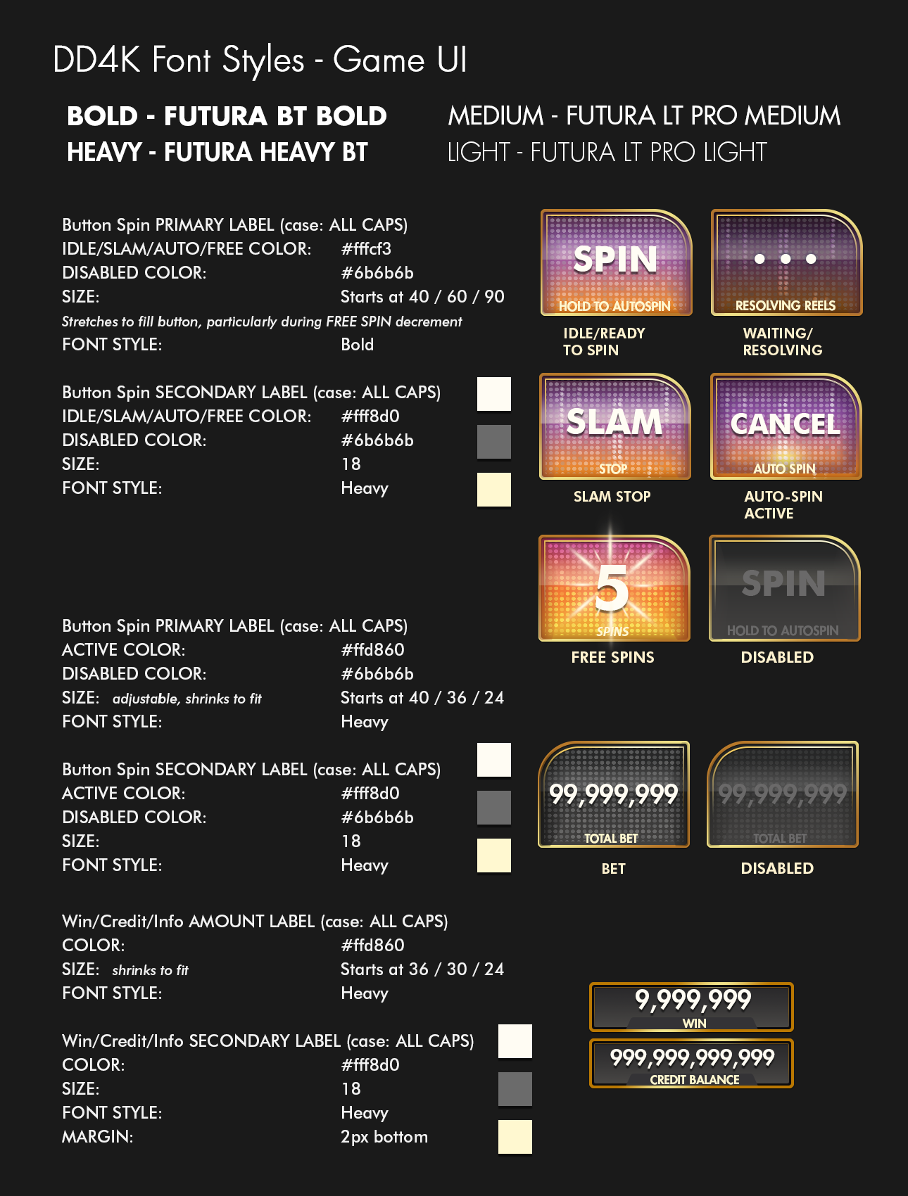
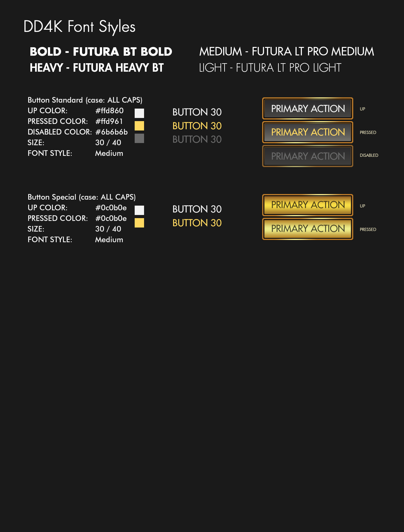
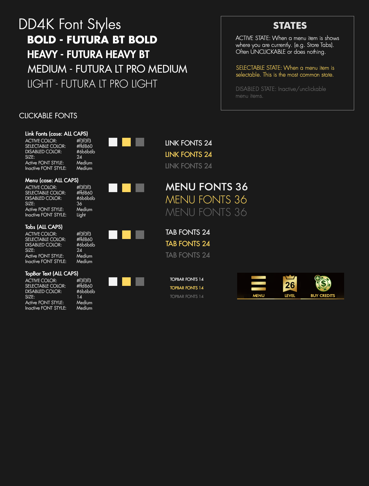
Initial style guide for fonts on text elements across the app.
Additionally, I set up a Copy Library for each feature which had the approved copy for each text element. That way QA or any other link in the chain could refer to what was supposed to be on-screen, instead of artists taking the time to update older comp shots. I served as Copy Library liaison to the Copy Edit team, ensuring that they had wireframes with each needed element marked out, if it was dynamic, contained variables, and planned for localization.
UI Work
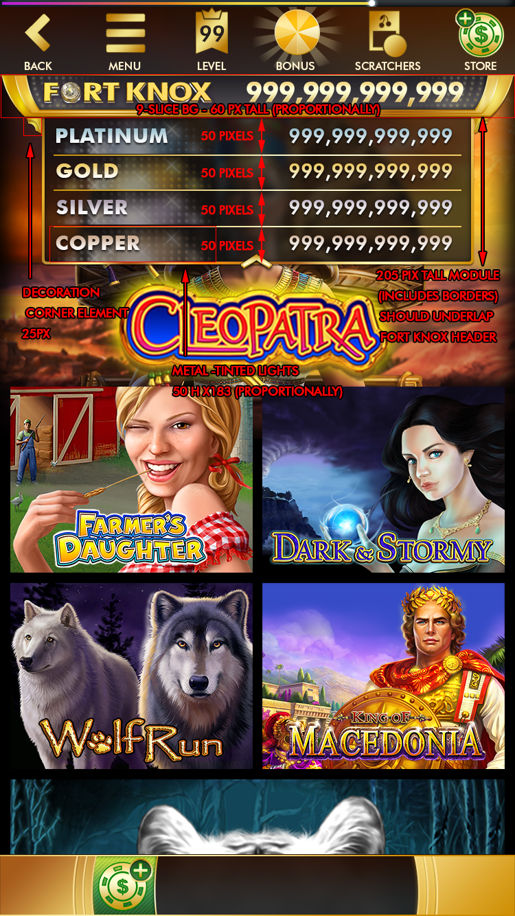
When I take on design of UI elements, I try to also think how they need to be constructed in the technological constraints we have. So not only do I create style sheets, sometimes I create annotations showing the construction limits we have or modular assets that can be re-used to keep downloads smaller.
In the concepts below, you'll find both matrixes for a number of button types, as well as how to construct those elements. I would also give annotated mockups to developers
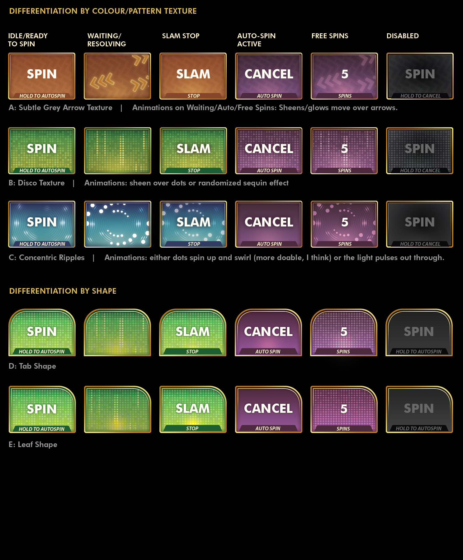
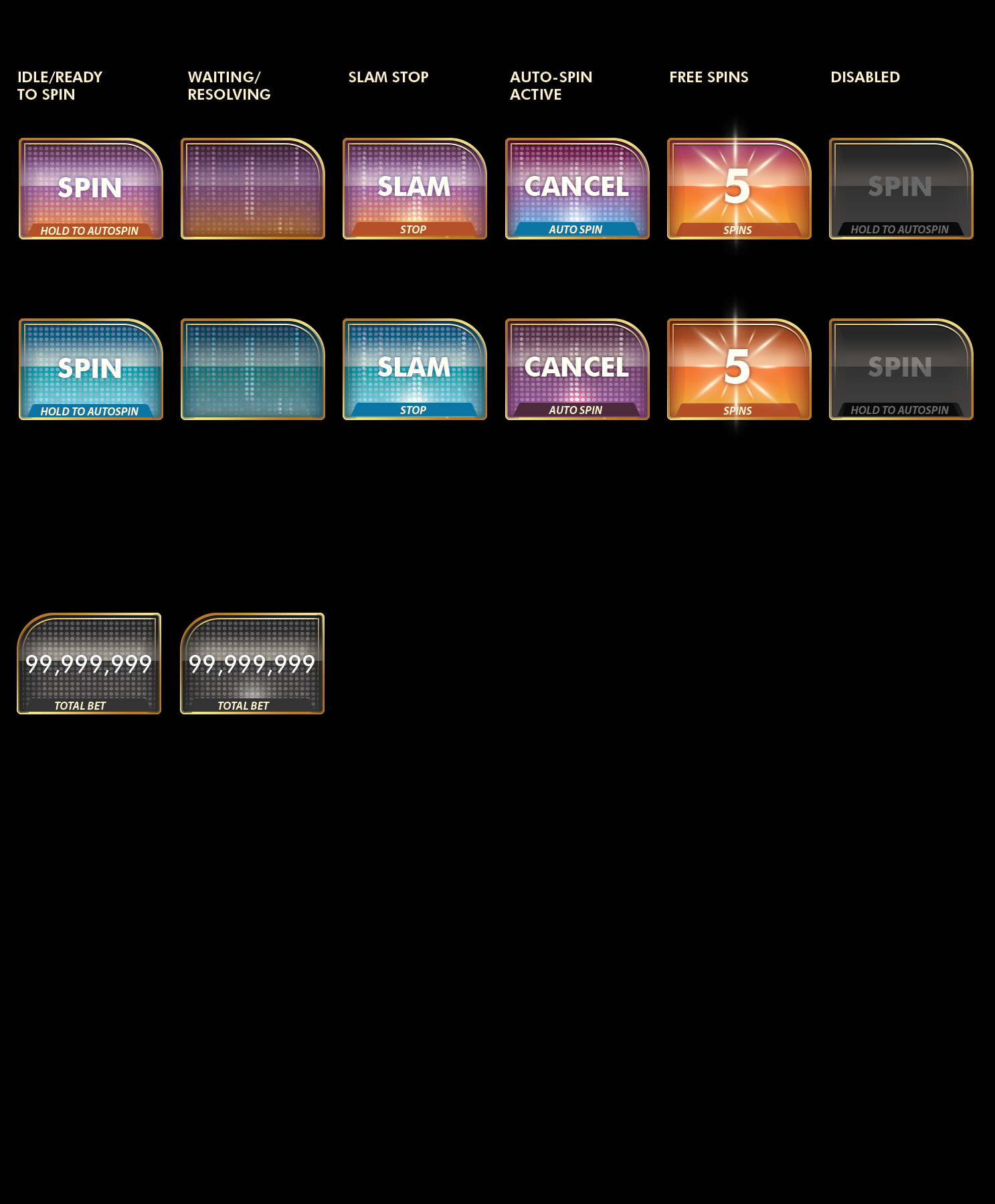
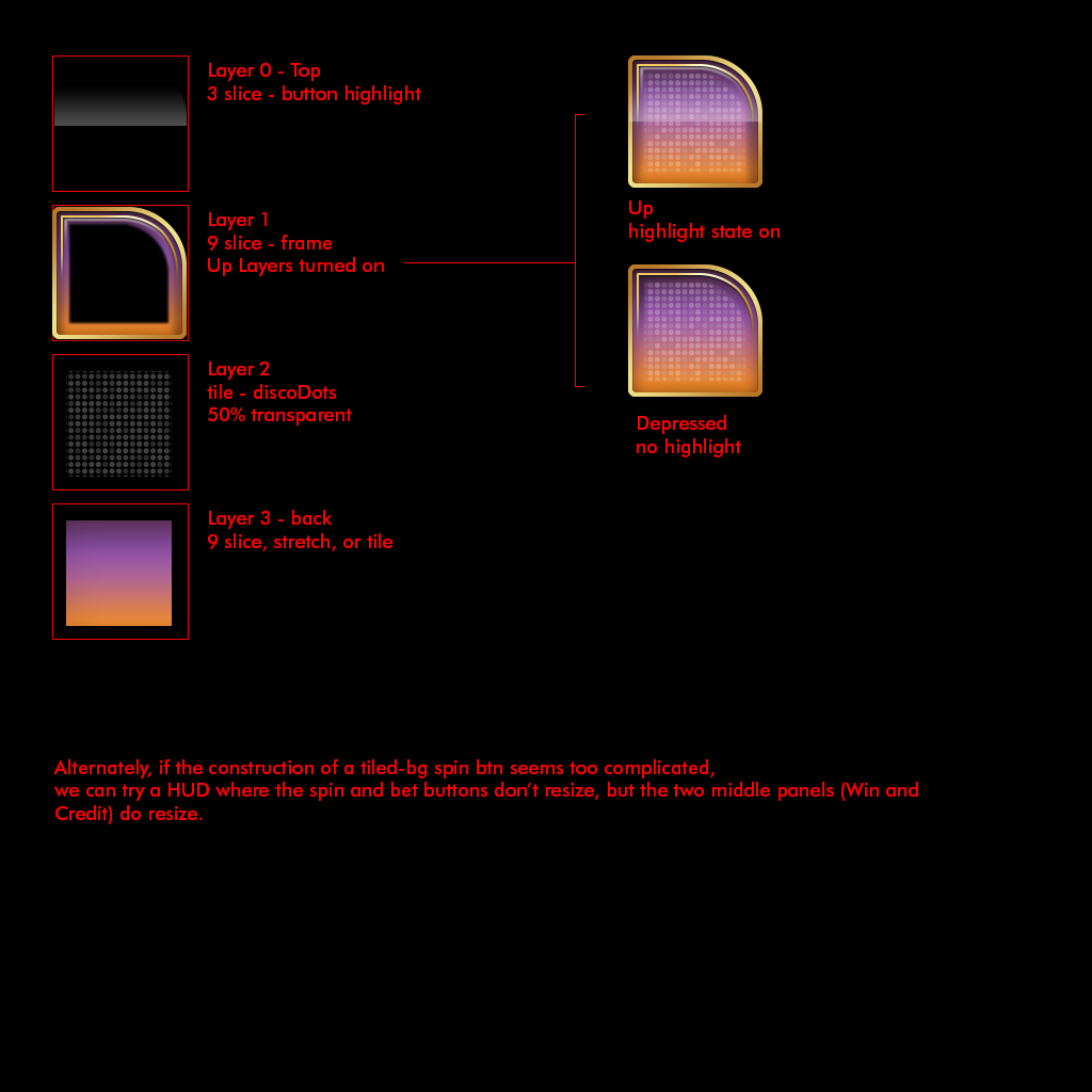
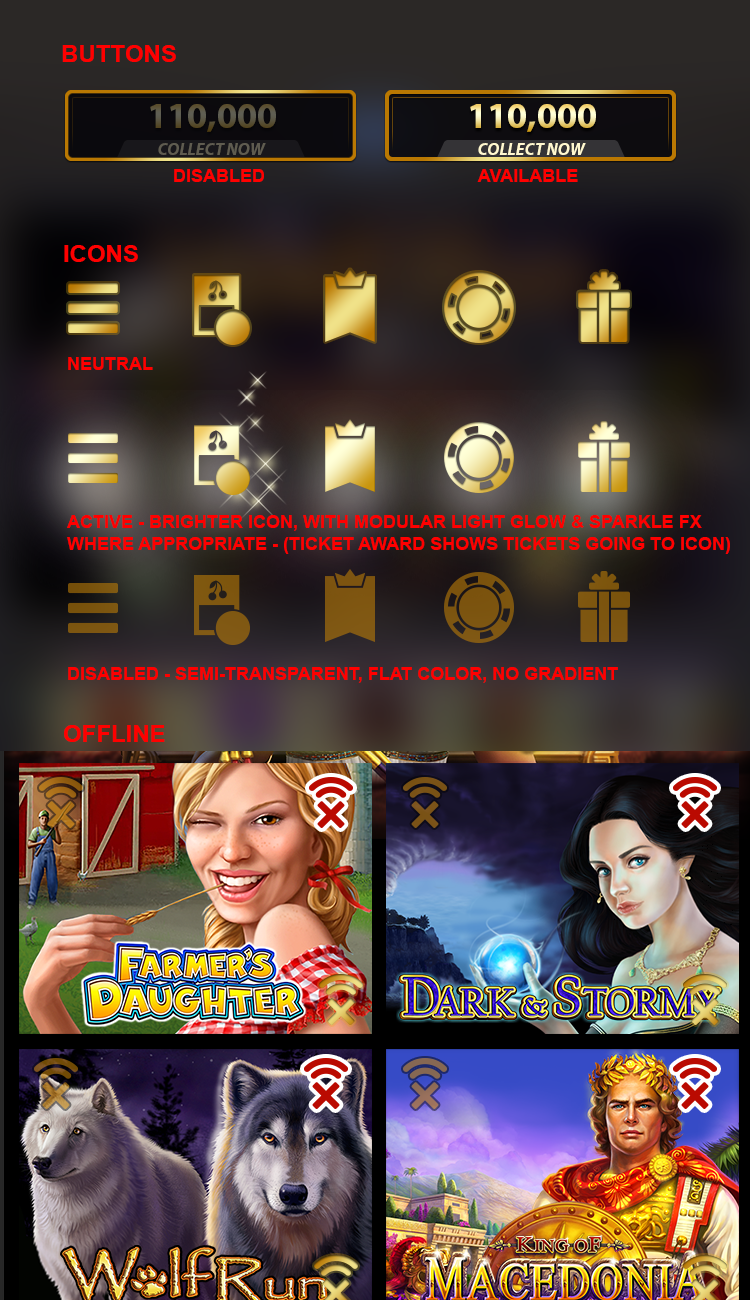
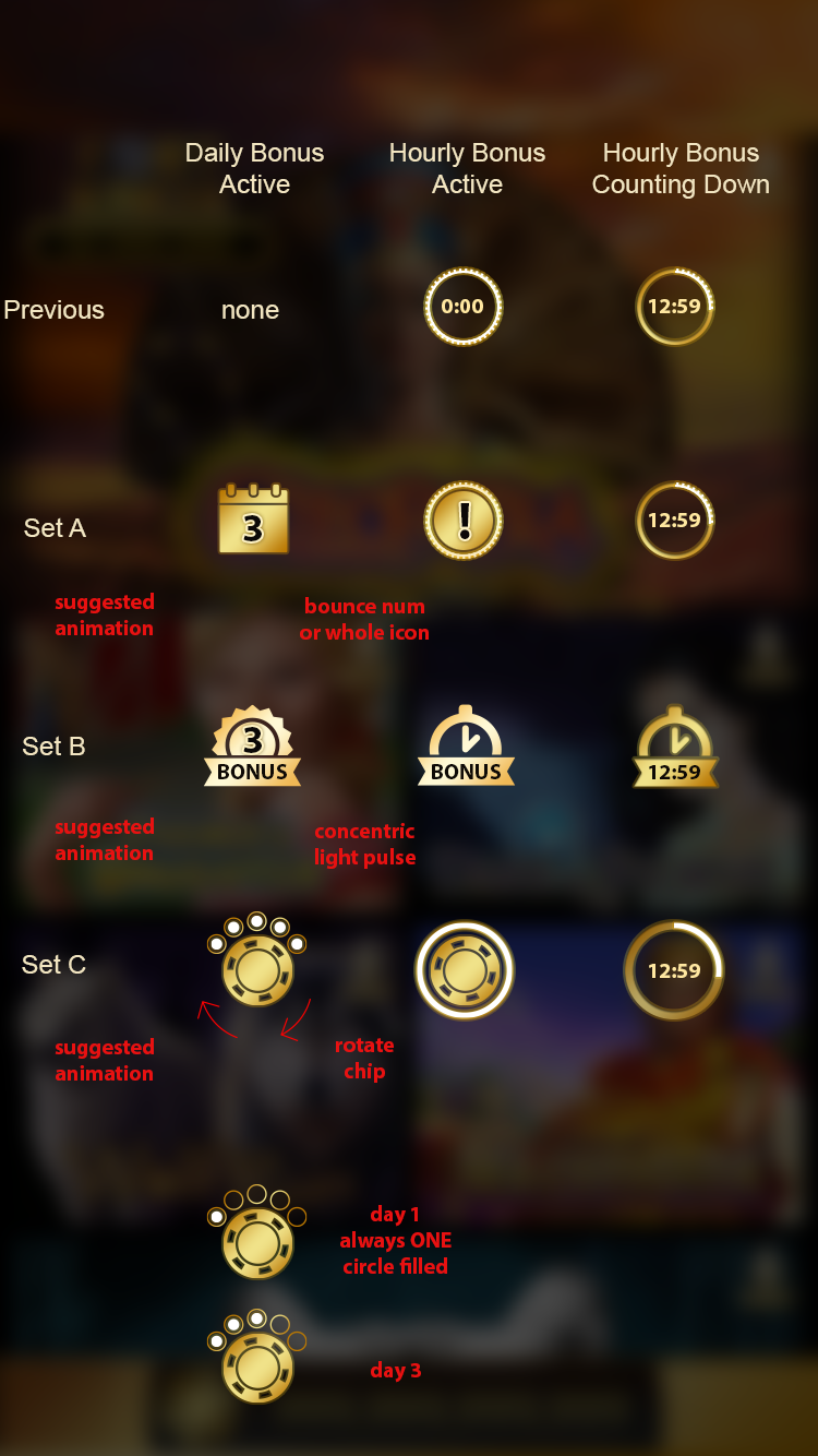
Left to Right: Construction of Jackpot Meter when fully open, Spin Button concepts with all states visible, refined versions of favoured Spin Button design, Construction of Spin Button elements for use inside Unity, Active and Inactive states of the primary icons in the top bar/header elements, concepts for timed bonuses.
Iconography
The first version of Doubledown Fort Knox was a fairly flat style. As such a lot of the early icon exploration veered away from the skeumorphic look favoured by other apps.
I tested a lot of my icon designs at different sizes, to ensure legibility. And I tested line widths and construction on a variety of platforms.
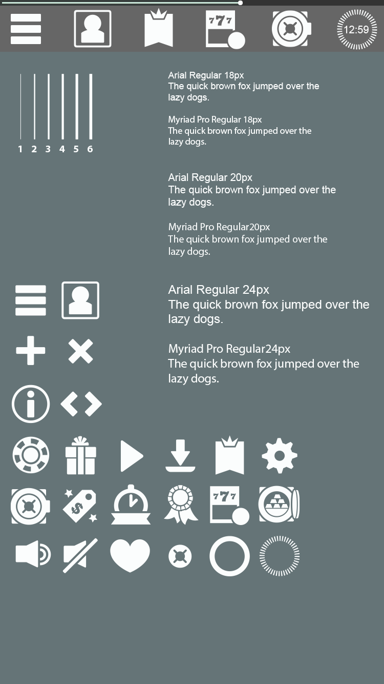
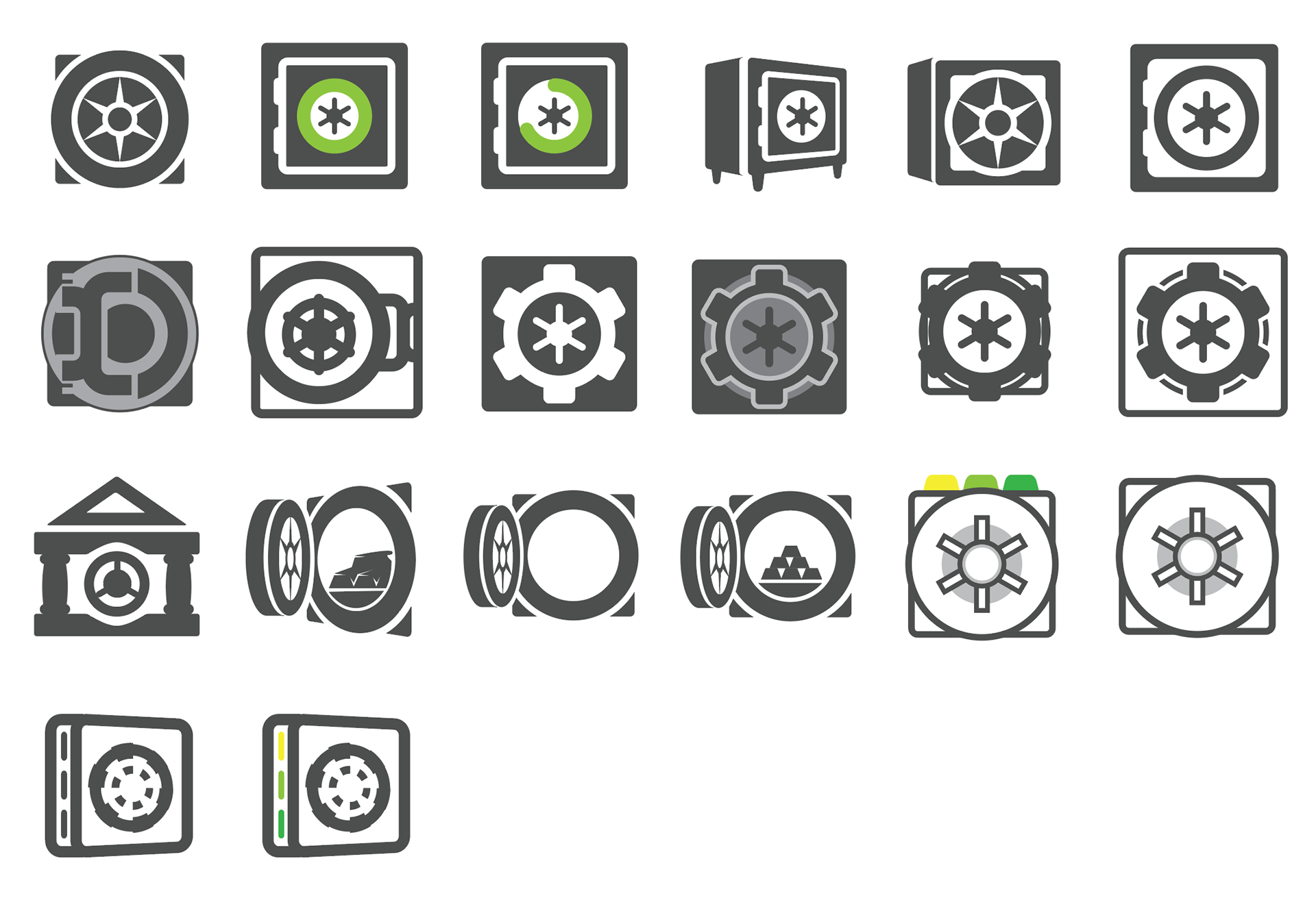
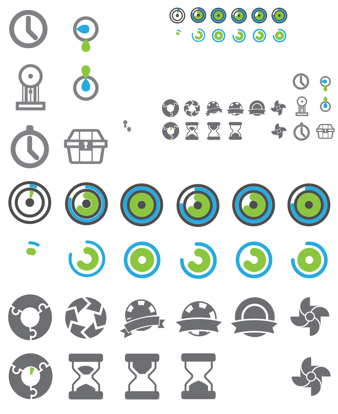
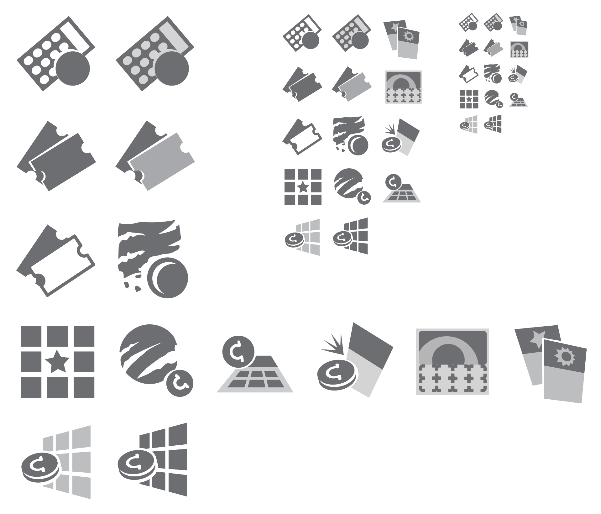
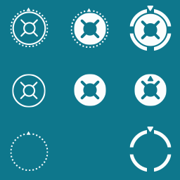
Left to Right: Icon Test Screen for iPhone, icon concepts for Vault feature, icon concepts for Bonus Timers, icon concepts for Scratchers, and loading icons for animation purposes.
Evolution of a Feature
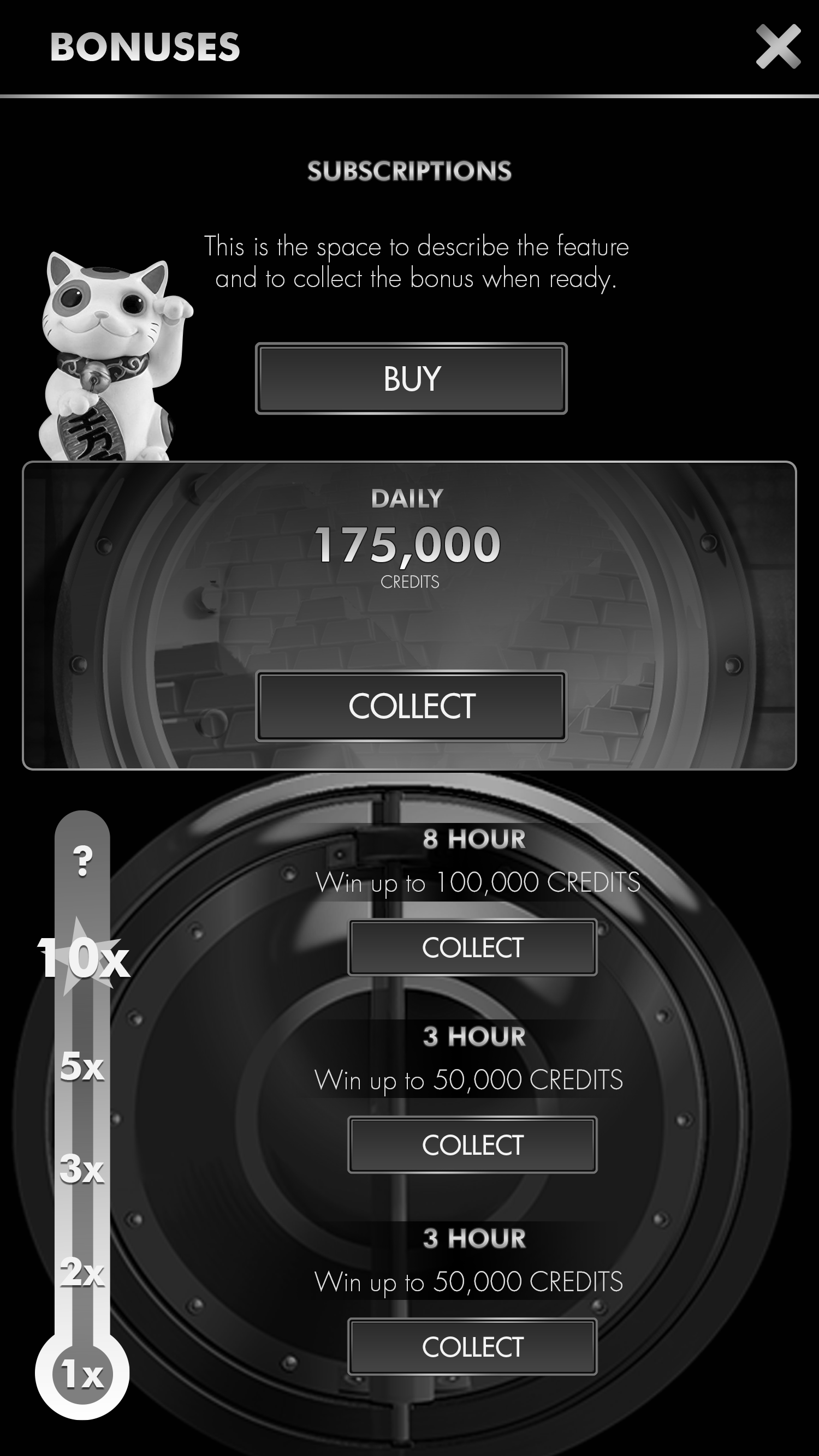
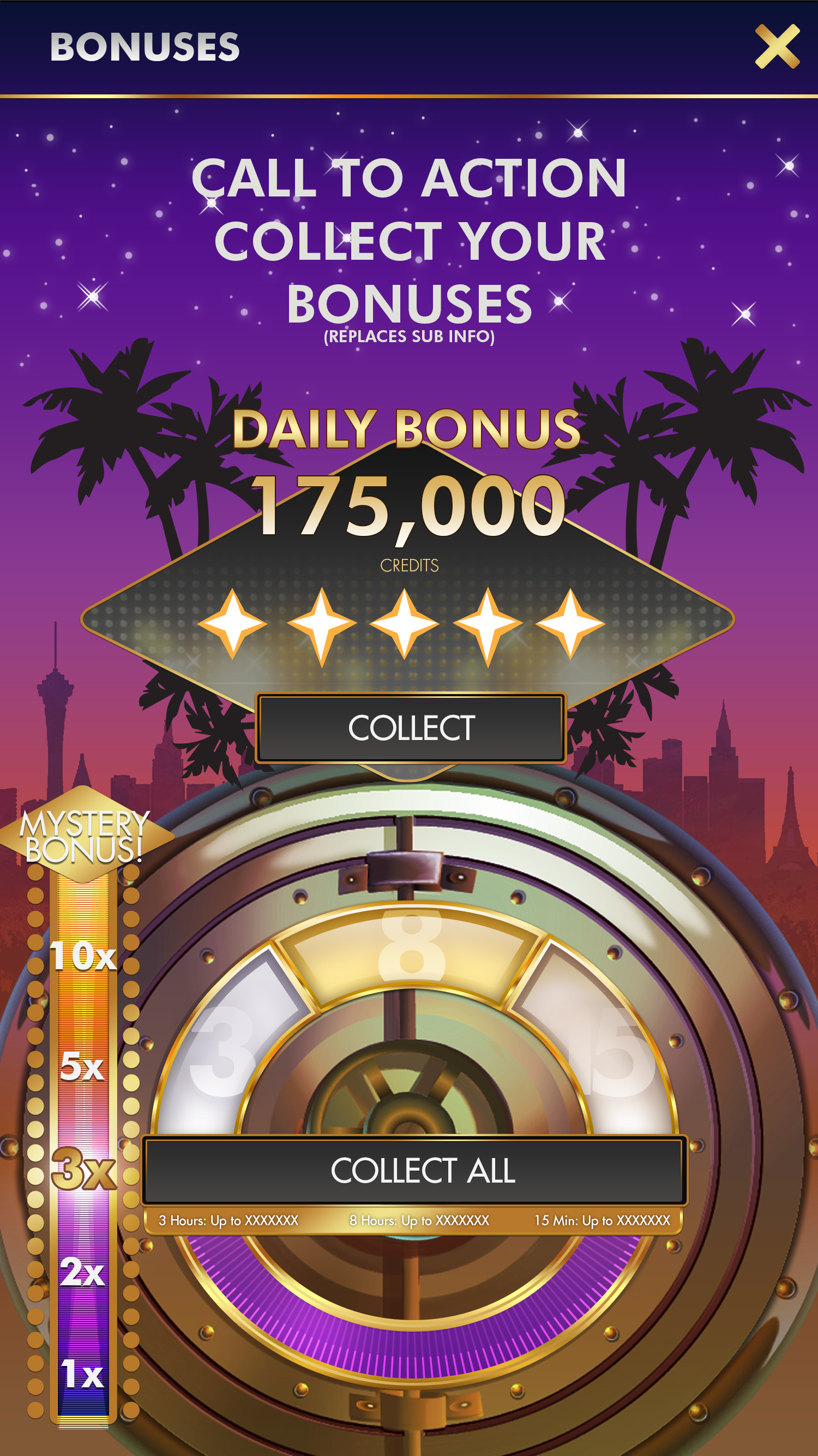
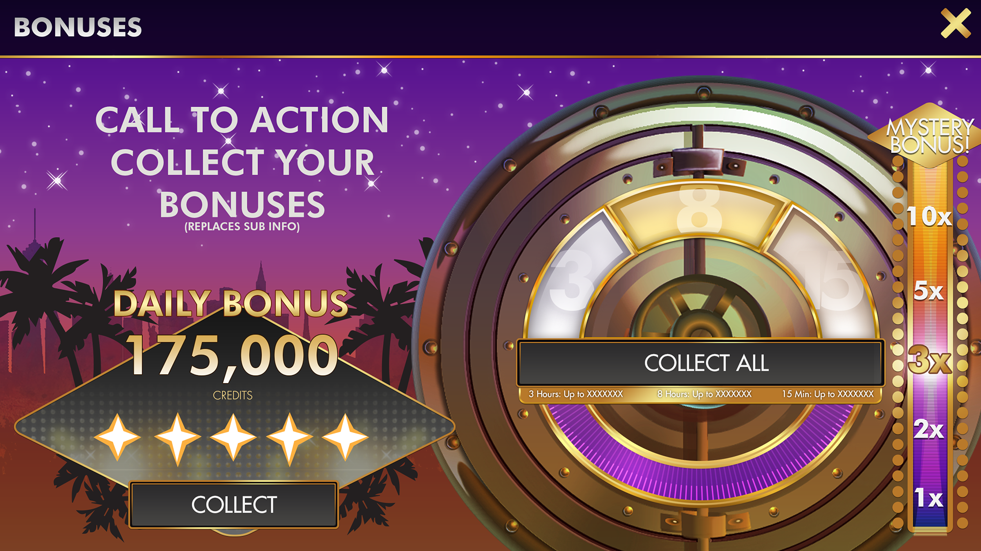
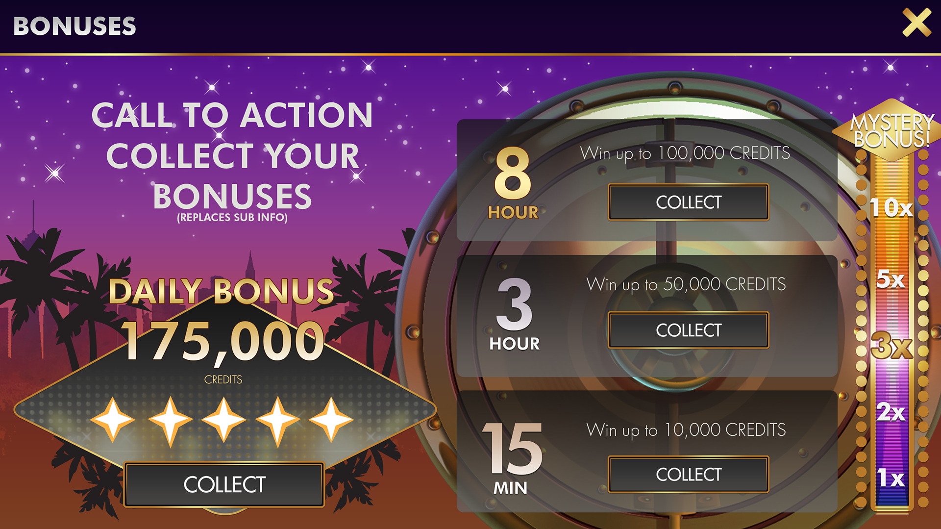
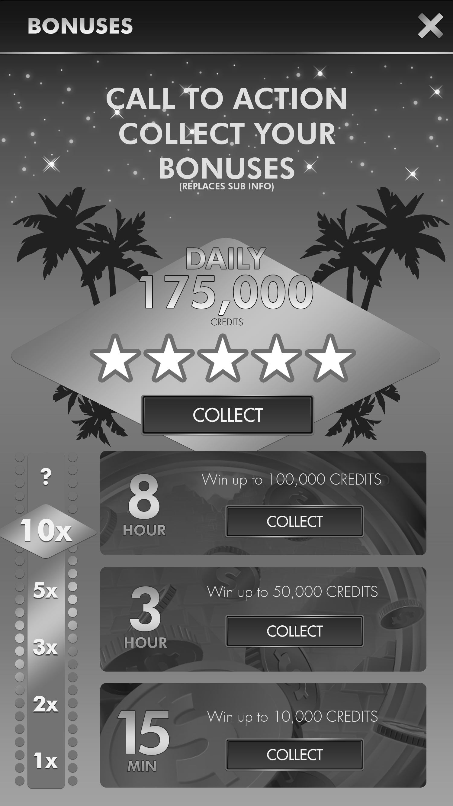
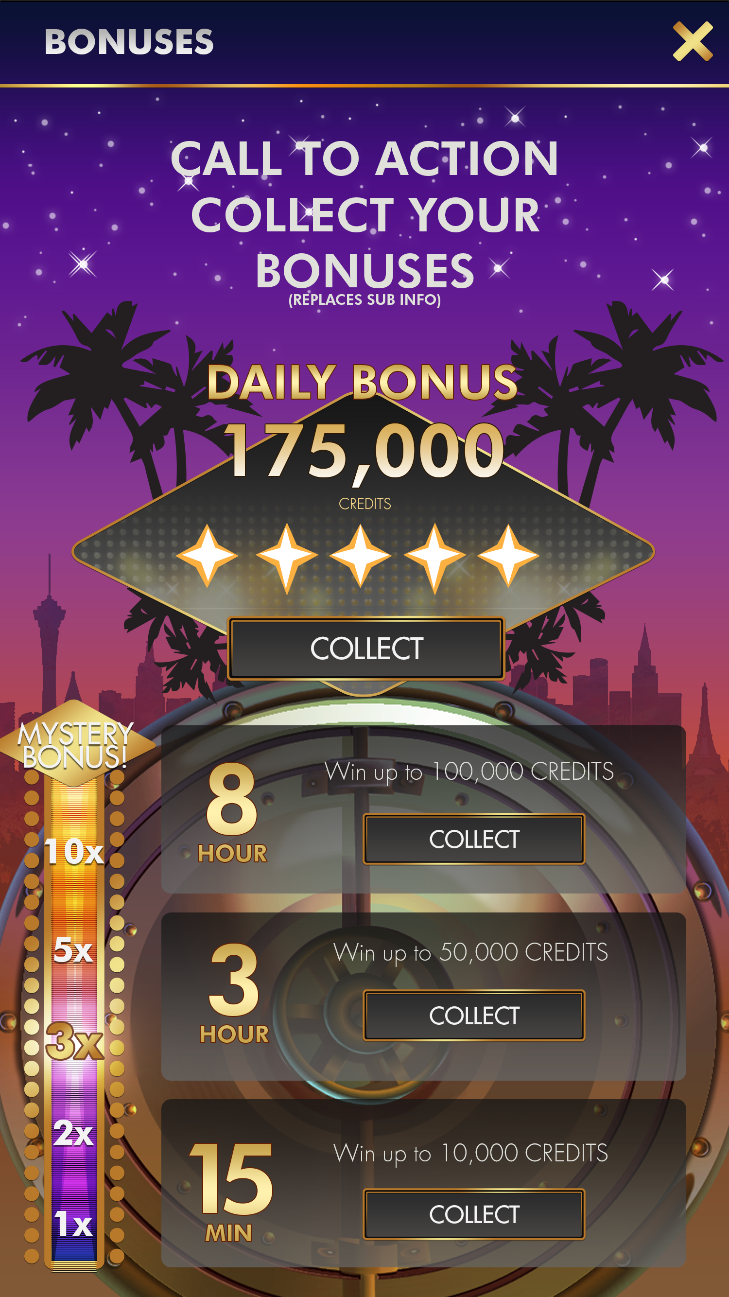
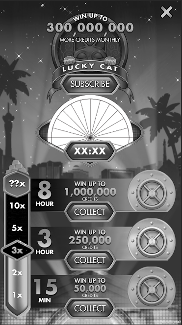
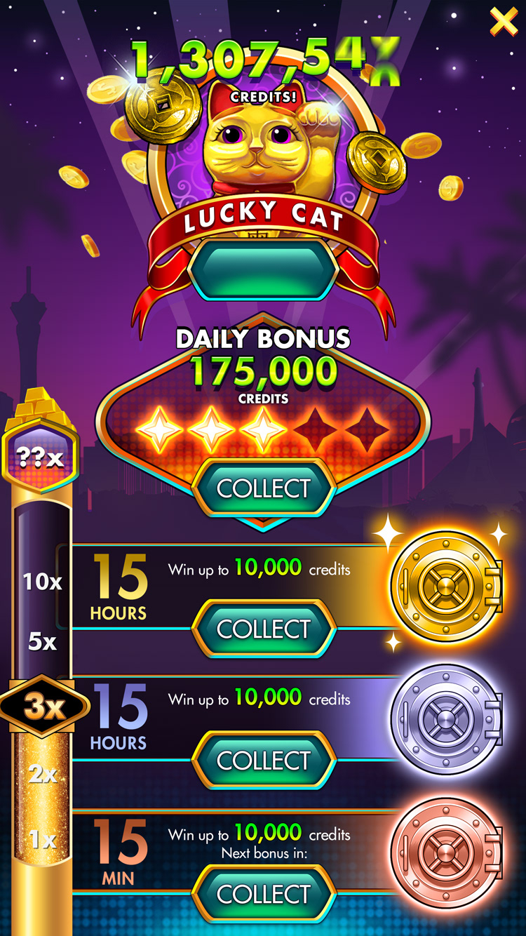
Example of how the Express Bonus Feature evolved in the app. Even as we started veering back towards a more skeuomorphic or 3D look in certain parts of the app, I developed some of the persistent elements that remained to this day, including the Disco Dots palette that you see in Bonus elements and in headers and ads.
Additional Team Credits:
UX: Peter Lewis, Janine Bostock
UI: Andy McCulloch, Derek McCaughan provided additional final polish.
